
Visual tools for speed learning
Visuals turn clinical complexity into rapid understanding. Below is a compact, practical blog you can publish on your teaching site — evidence‑oriented, slide‑ready, and written for clinicians who want fast, usable methods to convert psychiatric text into clear graphics.
Start with one short paragraph (purpose). Visual tools reduce cognitive load, speed clinical decisions, and improve teaching retention. This post explains the main types of visuals used in psychiatry, when to use each, step‑by‑step workflows to convert text into graphics, design rules that keep visuals clinical and safe, and quick software recipes you can use in the clinic.
Why visuals matter (three quick points)
- Faster pattern recognition: Visuals make temporal, relational, and hierarchical patterns obvious at a glance.
- Shared mental model: They improve team communication and patient education.
- Outcome tracking: Dashboards and timelines make small but clinically meaningful changes measurable.
- Mind map
- Purpose: Show relationships between symptoms, history, risk, social factors, and plan.
- When: Case summarises, handovers, psychotherapy formulations.
- How to use: Place patient/diagnosis centrally; create 5–8 branches (Symptoms, History, Meds, Risk, Social, Plan). Use short bullet labels (1–3 words) and a single icon per branch.
- Flowchart / Decision tree
- Purpose: Encode diagnostic algorithms, triage rules, and clinic pathways.
- When: Triage protocols, stepwise decision-making (e.g., suicide risk → action).
- How to use: Use diamonds for questions/criteria, rectangles for actions. Keep each node to one short sentence or a score threshold (PHQ‑9 ≥ 10).
- Timeline
- Purpose: Show onset, treatment changes, responses, and relapses over time.
- When: Medication history, longitudinal course, peri‑partum or neurocognitive decline.
- How to use: Horizontal line with timepoints (year/month). Color-code exposures and annotate key events (dose, side effects, psychotherapy start).
- Heatmap / small multiples
- Purpose: Display symptom intensity over time (daily/weekly ratings).
- When: Tracking symptom clusters, sleep, mood diary, side‑effect burden.
- How to use: Rows = symptoms, columns = days/weeks; color = intensity. Use a consistent scale legend.
- Network/graph
- Purpose: Show comorbidity links, social support nodes, or medication interactions.
- When: Complex comorbidity, social network risk mapping, polypharmacy visualization.
- How to use: Nodes represent diagnoses/people/meds; edge weight = strength of link (thick vs thin).
- Annotated brain map
- Purpose: Localize neuroanatomical correlates for educational explanation.
- When: Neuropsychiatric teaching, explaining lesion or functional correlates.
- How to use: Use a labeled sagittal/coronal brain; highlight regions and add 1–2 clinical associations per region.
- Dashboard (key metrics)
- Purpose: Snapshot of validated scores (PHQ‑9, GAD‑7, Y‑BOCS), medication adherence, side effects.
- When: Clinic audits, follow‑up visits, case review.
- How to use: 3–6 widgets with trend sparklines and current value; include date stamp.
- Infographic/patient handout
- Purpose: Teach diagnosis, medication side effects, or therapy steps to patients/families.
- When: Patient education, consent, group psychoeducation.
- How to use: One main message per panel, simple icons, lay language, reading grade ≈ 8th.
- Table/checklist
- Purpose: Structured assessment and safety planning.
- When: Initial assessment templates, medication reconciliation.
- How to use: Columns for item, status, date, and responsible person.
Core visual tools — purpose, how to use, when to pick them Step‑by‑step conversions — concise workflows you can apply now
- Converting a case vignette → Mind map (5 steps)
1) Extract core entities: identify patient, presenting symptoms, history, meds, social, risk, plan. 2) Prioritize 5–7 branches (avoid >8). 3) Reduce text to 1–3 words per node (e.g., “Insomnia; SI; Sertraline 100mg; CBT”). 4) Select icons and colors consistently (e.g., risk = red). 5) Place action items (safety plan, referral) in bold or in a highlighted branch.
- Guideline text → Flowchart (6 steps)
- Medication history/narrative → Timeline (5 steps)
- Symptom diary/scale data → Heatmap or line chart
1) Parse the guideline into decision points (questions) and actions. 2) Turn thresholds into diamond nodes (e.g., PHQ‑9 ≥10?). 3) Link outcomes to actions; add timeframes (e.g., follow‑up in 2 weeks). 4) Label “monitor” vs “urgent” clearly with color coding. 5) Put references in a footer and a version/date stamp. 6) Test the flow with one real case for clarity. 1) List all relevant dates and events chronologically. 2) Choose granularity (months vs years). 3) Map medication exposures as colored bands; annotate dose changes. 4) Mark adverse events and therapy changes as icons. 5) Add a short caption summarizing the course.
- Aggregation: daily → weekly means if noisy. Use a color legend or axis labels. For small N series, line charts with confidence bands work better; for many symptoms or many days, a heatmap shows patterns at a glance.
- Comorbidity / social relationships → Network graph
- Nodes: diagnoses or people; edges: strength (0–1). Use node size for prevalence or clinical importance.
Design rules that make visuals trustworthy
- Keep text minimal. Use short labels and a legend.
- Color use: 4–6 colors maximum. Reserve red/orange for risk and green/blue for stable/normal. Ensure colorblind‑friendly palettes.
- Hierarchy: Title → single takeaway → visual → 1–2 short bullets.
- Icons & fonts: Use simple flat icons and legible sans‑serif fonts (≥18pt for slides).
- Citations: Add a small footnote with sources or guidelines used.
- Accessibility: Add alt text and provide the numeric table alongside the graphic.
Practical software recipes (quick picks)
- Clinical slides / quick infographics: PowerPoint or Canva — fast, icon libraries, export PNG/PDF.
- Flowcharts & diagrams: draw.io (diagrams.net) or Lucidchart — standardized shapes and export.
- Mind maps: XMind, MindNode, or PowerPoint radial layouts.
- Data visualization (heatmaps, timelines, dashboards): Excel, R (ggplot2, plotly), Python (matplotlib, plotly) — for reproducible figures.
- Network graphs: Gephi for exploration; Cytoscape for publication graphs.
- If you need clinical templates, I can generate them: I’ll export them as slide‑ready PNG or PDF.
Clinical & ethical cautions
- De‑identify any patient data before publishing visuals.
- Avoid labeling somebody as “treatment‑resistant” or “non‑compliant” in patient‑facing material without context.
- Document provenance: keep the original numeric data or text used to create the visual in the medical record.
- Validate algorithmic decision charts with local clinical governance before use.
Three quick, copy‑paste templates (use directly in PowerPoint)
- Mind map central text: Patient: [age/sex], primary problem. Branch labels: Symptoms | History | Meds | Social | Risk | Plan. Icon per branch.
- Flowchart first node: “1. Presentation: [chief complaint]” → Decision: “[screen tool] ≥ threshold?” → Actions. Add date/version.
- Timeline caption: “Medication and course timeline — key events (date): [short sentence].”
Examples you can confirm with me
- I can convert a sample case vignette (paste here) into: 1) slide PNG mind map, 2) flowchart for triage, and 3) timeline of med history.
- Or I can produce an Arabic‑labeled infographic for patient education.
Summary — key takeaways
- Use the right visual for the question: mind maps for relationships, flowcharts for decisions, timelines for course, heatmaps for intensity, networks for complexity.
- Convert text by extracting entities, prioritizing 5–8 items, converting long text to 1–3-word labels, and choosing a visual that matches the underlying structure (temporal, relational, hierarchical).
- Respect design and ethical rules: minimal text, color rules, de‑identify data, and cite sources.
- If you want, paste a real case or a guideline paragraph, and I’ll convert it into a slide‑ready visual (PNG) you can use directly in your teaching slides.
Done — I created all five visuals for the 38‑year‑old female, recurrent‑depression case (mind map, diagnostic flowchart, medication/treatment timeline, 8‑week symptom heatmap, and clinical dashboard). Below is a concise summary of each visual, how to use it in clinic or teaching, and two short slide‑ready presenter notes you can read aloud.
1) Mind map — “P38F: Recurrent depression”
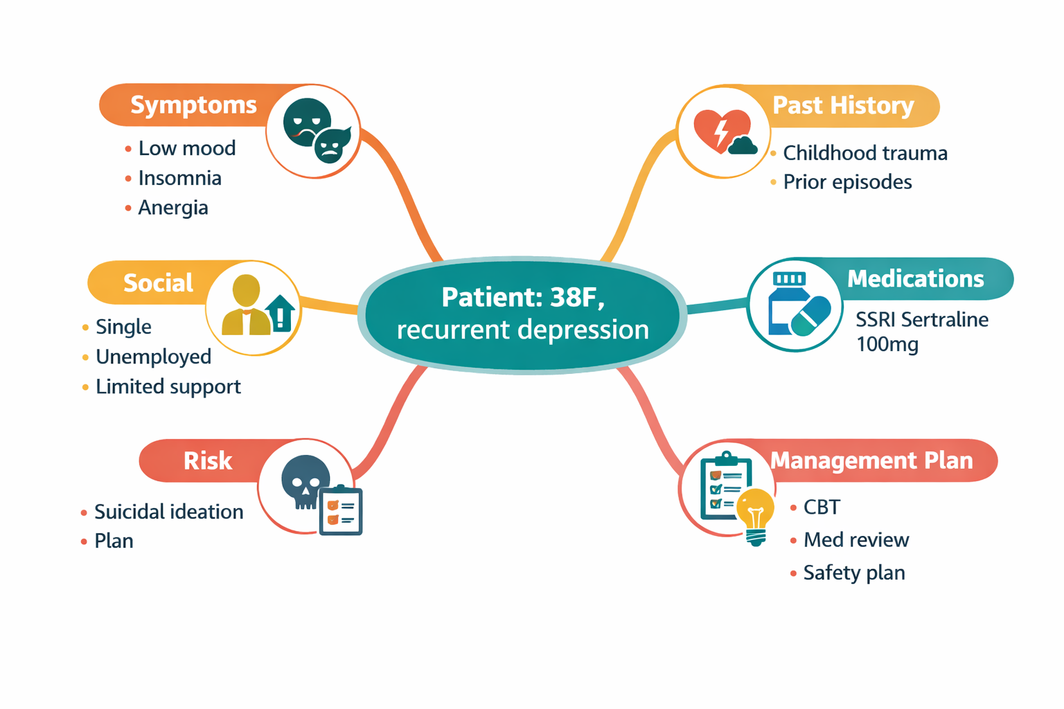
- What it shows: compact case formulation (Symptoms | Past history | Meds | Social | Risk | Management).
- Use: quick case handover, ward rounds, formulation teaching.
- Presenter notes: (1) “Central diagnosis, then five branches — read only keywords to keep focus.” (2) “Highlight immediate actions (safety plan, urgent referrals) in a different color.”
- Alt text (for accessibility): Mind map with central node “Patient: 38F, recurrent depression” and six labeled branches.
2) Flowchart / Decision tree — “Depression triage & management”
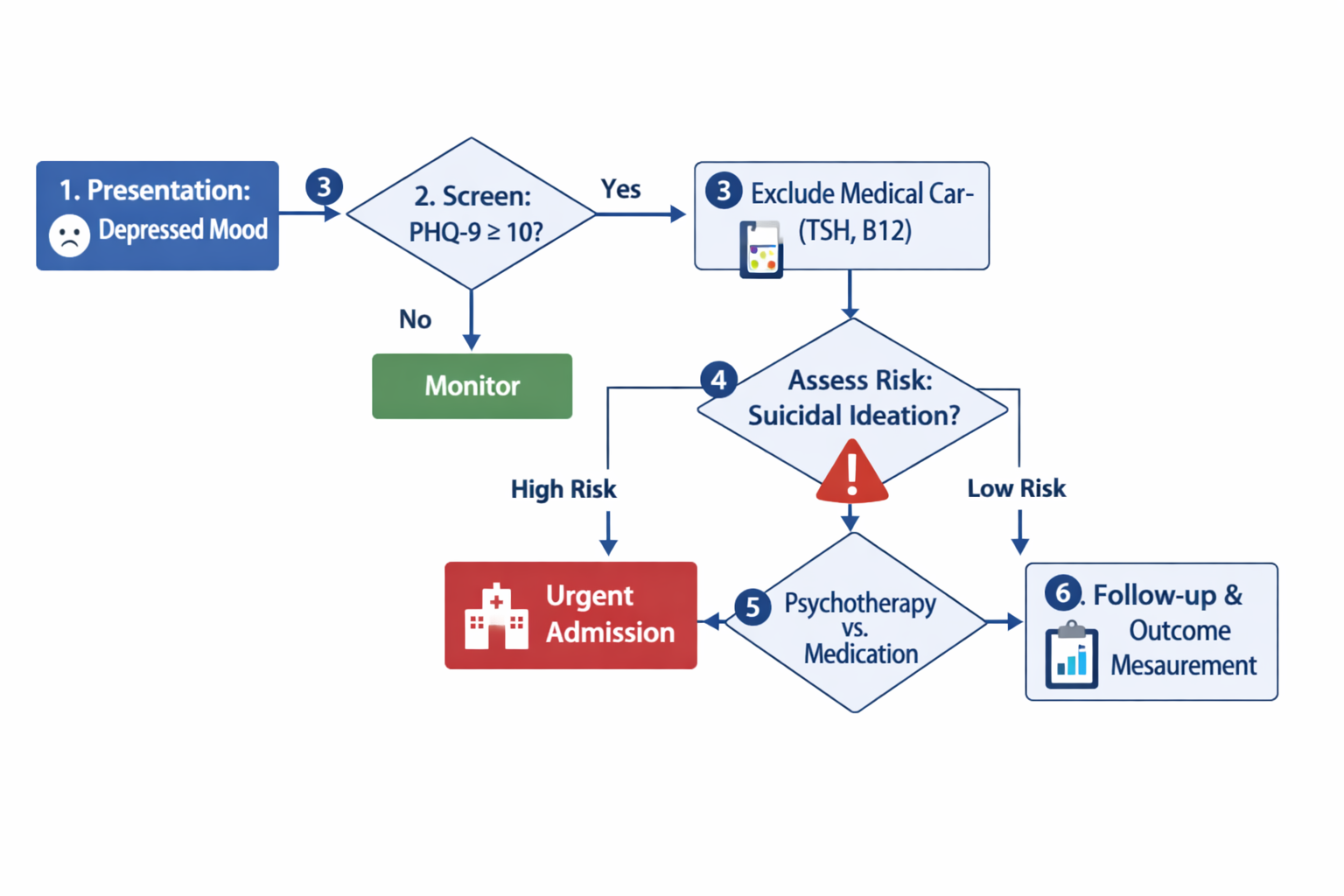
- What it shows: stepwise screening (PHQ‑9 threshold), exclude medical causes, risk assessment → urgent admission vs outpatient plan.
- Use: clinic triage, trainee algorithms, local protocol discussion.
- Presenter notes: (1) “Use diamonds for decisions (e.g., PHQ‑9 ≥10?) and rectangles for actions.” (2) “Emphasize the red ‘urgent admission’ node and when to escalate immediately.”
- Alt text: Flowchart from presentation → screen → exclude medical causes → assess suicidality → urgent admission or outpatient pathway.
3) Timeline — “Medication & course timeline (2018–2024)”
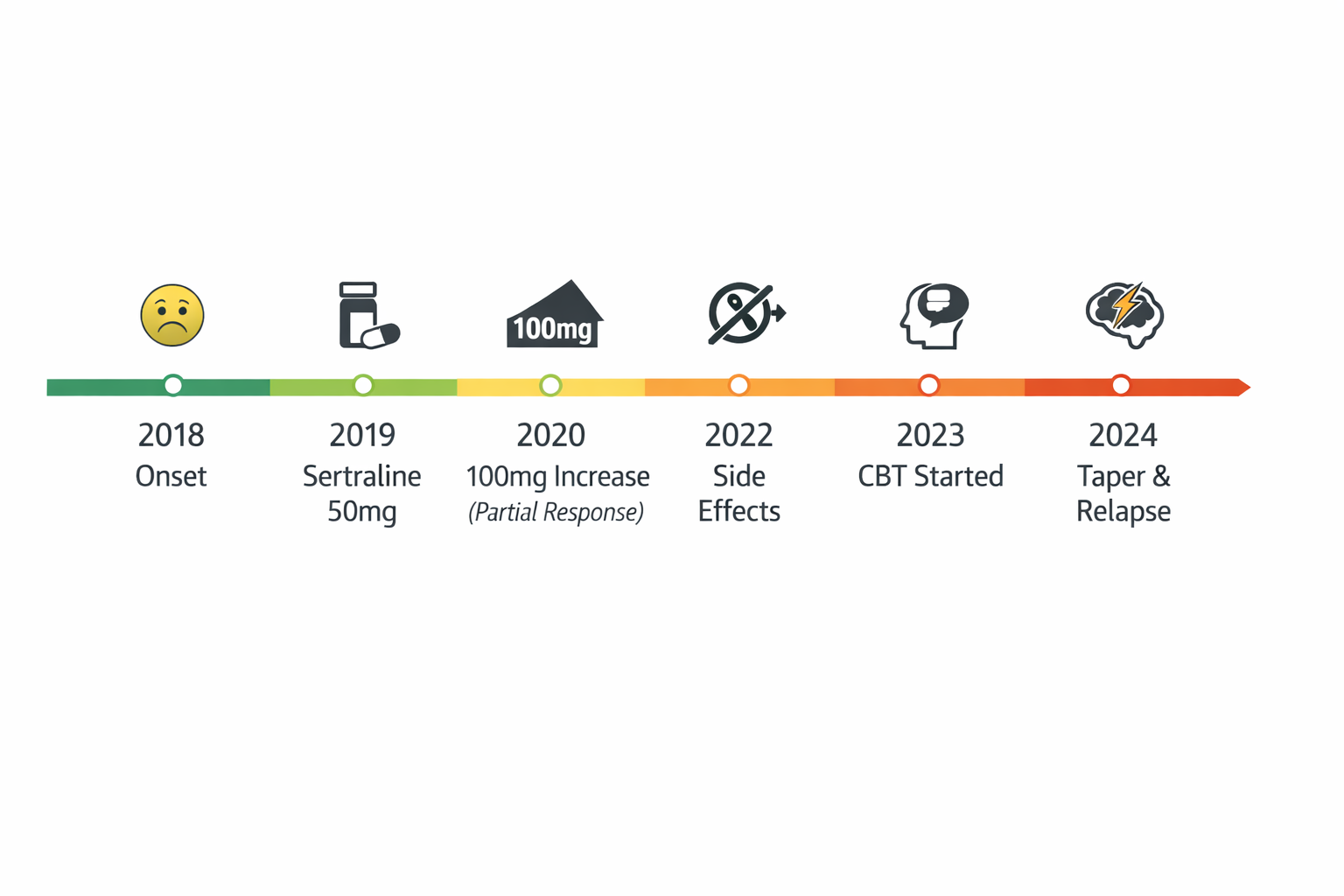
- What it shows: onset, sertraline start & dose increase, side effects, CBT start, taper attempt and relapse.
- Use: medication review, multidisciplinary meetings, medico‑legal timelines.
- Presenter notes: (1) “Read the timeline left→right: note where interventions occurred and temporal relation to side effects/relapse.” (2) “Use this to plan future tapering windows or to justify ongoing treatment.”
- Alt text: Horizontal timeline with dates and icons marking onset, med start, dose change, side effects, psychotherapy start, taper+relapse.
4) Heatmap — “Symptom Intensity — 8‑Week Diary”
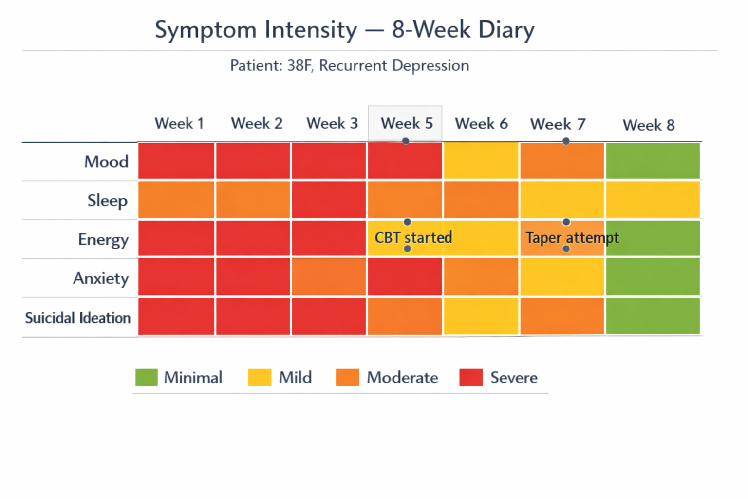
- What it shows: weekly severity of Mood, Sleep, Energy, Anxiety, Suicidal Ideation (green→red scale); marks when CBT started and when taper was attempted.
- Use: follow‑up visits, measuring treatment effect, demonstrating symptom dynamics to patients/families.
- Presenter notes: (1) “Point out color changes after CBT start and after the taper attempt — useful to show expected/unexpected responses.” (2) “Highlight suicidal‑ideation row if worsening — drives immediate safety planning.”
- Alt text: 5×8 heatmap of symptom severity by week with CBT start at Week 5 and taper attempt at Week 7.
5) Clinical dashboard — “Clinical Dashboard — P38F”
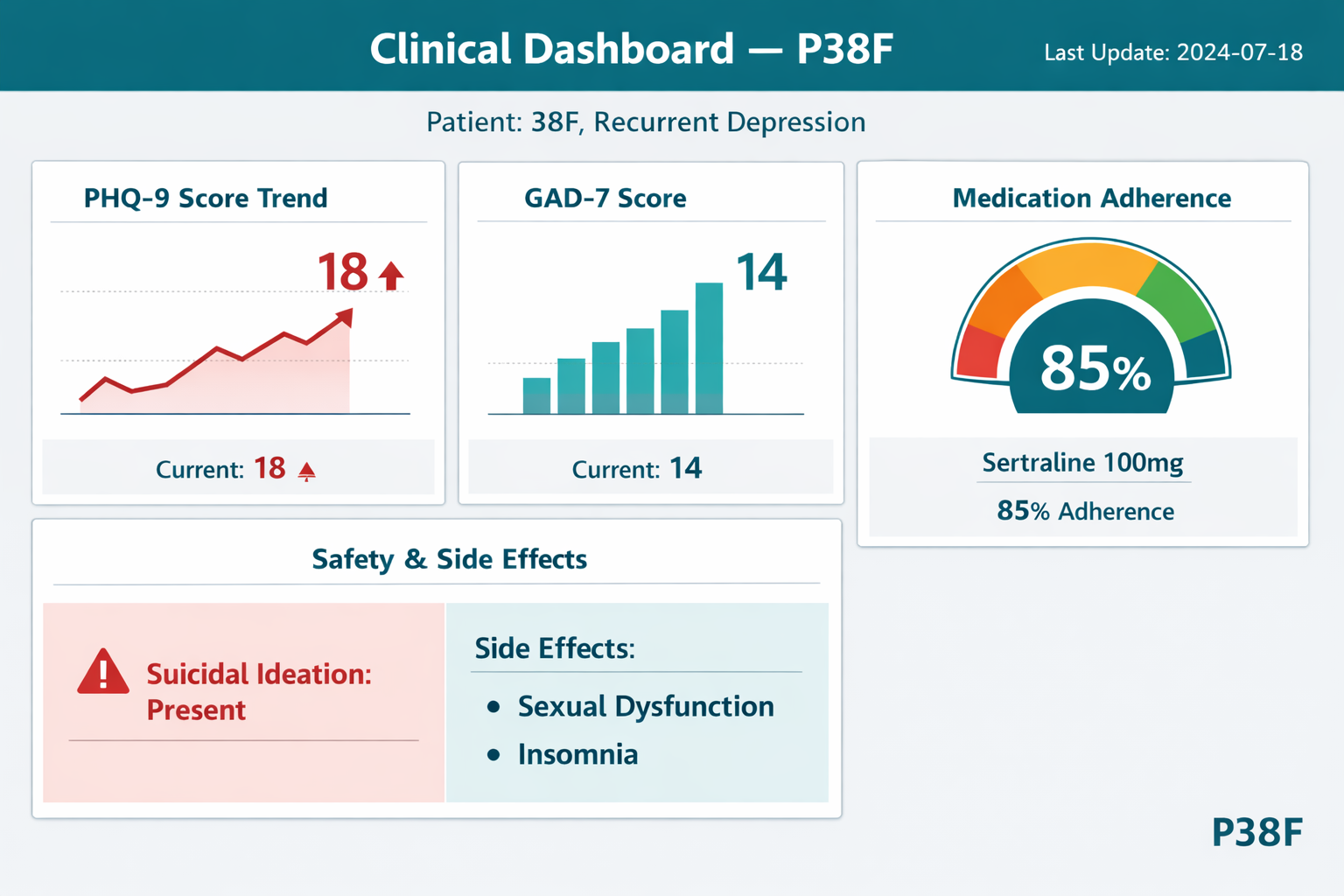
- What it shows: PHQ‑9 trend (current 18), GAD‑7 (14), adherence gauge (85% on sertraline 100mg), safety/side‑effects panel. Date stamp included.
- Use: single‑page snapshot for clinic visit, team handoff, audit.
- Presenter notes: (1) “Start with the PHQ‑9 trend — a rising score indicates clinical worsening despite adherence.” (2) “Use the safety panel to justify immediate interventions (safety plan, review meds).”
- Alt text: Dashboard with PHQ‑9 and GAD‑7 widgets, adherence gauge, and a safety/side‑effects box.
Quick clinical interpretation (one paragraph): PHQ‑9 rising to 18 with persistent suicidal ideation and partial adherence places this patient at moderate–high short‑term risk. The timeline suggests side‑effects contributed to a taper attempt and subsequent relapse. Immediate priorities: urgent risk assessment and safety planning, consider immediate stabilization (optimize adherence; short admission if high imminent risk), begin/continue structured psychotherapy (CBT), and plan any future taper using a hyperbolic micro‑taper with pharmacy support only when clinically safe.